Common Web Layout Elements
There’s a reason we talk about web design. You start out with a blank page, and you can take it so many directions. And if you don’t have much experience, starting out with a blank page might be a bit scary. We have over 25 years’ experience and we’ll give you some common rules of thumb to help you design your site.
Even now with the new focus on mobile Web, almost all mainstream webpages are built from these parts:
- Header: Visible at the top of every page on the site. Contains information relevant to all pages (like site name or logo) and an easy-to-use navigation system.
- Main Content: The biggest region, containing content unique to the current page.
- Side Content:
- Information complementing the main content
- Information shared among a subset of pages
- Alternative navigation system
- Everything not absolutely required by the page’s main content.
- Footer: Visible at the bottom of every page on the site. Like the header, contains less prominent global information like legal notices or contact info.
These elements are quite common in all form factors, but they can be laid out different ways.
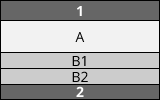
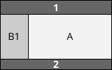
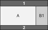
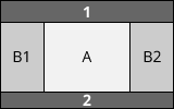
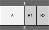
Here are some examples (1 represents header, 2 footer; A main content; B1, B2 things on the side):
1-column layout. Especially important for mobile browsers so you don’t clutter the small screen up.
2-column layout. Often used to target tablets, since they have medium-size screens.
3-column layouts. Only suitable for desktops with big screens. (Even many desktop-users prefer viewing things in small windows rather than fullscreen.)
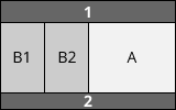
The real fun begins when you start mixing them all together:
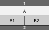
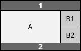
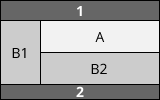
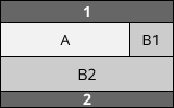
These are just examples and you’re quite free to lay things out as you want. You may notice that, while the content can move around on the screen, we always keep the header (1) on top and the footer (2) at the bottom. Also, the main content (A) matters most, so give it most of the space.
These are rules of thumb you can draw on. There are complex designs and exceptions, of course. In other articles we’ll discuss how to design responsive sites (sites that change depending on the screen size) and sites whose layouts vary between pages. For now, it’s best to keep your layout consistent throughout your site.